UART Tip #15: Out of the Box Pastel Grays: How to Spice Them Up with Christine Camilleri
Grays enhance saturated colors, provide balance when there is much going on in your painting, are rest areas for the eye and are invaluable for shadows and showing form or structure.
How do we achieve grays that are luminous and interesting? One way is to use complements, however, I have found that this can work with some combinations, and not so well with others. Blue violet (purple) and yellow, for example, makes a ghastly color combination when layered one on top of the other. Also it can be difficult for pastellists to make successful grays so why not start by using the grays you already have in your pastel collection? This means you have a base to work with rather than starting from scratch.
The trick to working with “out of the box” grays is to enhance them. This means choosing a color that complements it in these ways: choose a color that is the same value and use the same warmth or coolness of colors to go with it. Also try to use blues, yellows and reds in your combination to keep it simple. Or just use two colors on top of your gray like green-blue (a dark, forest green) and red-violet (a deep magenta) which go very beautifully together.
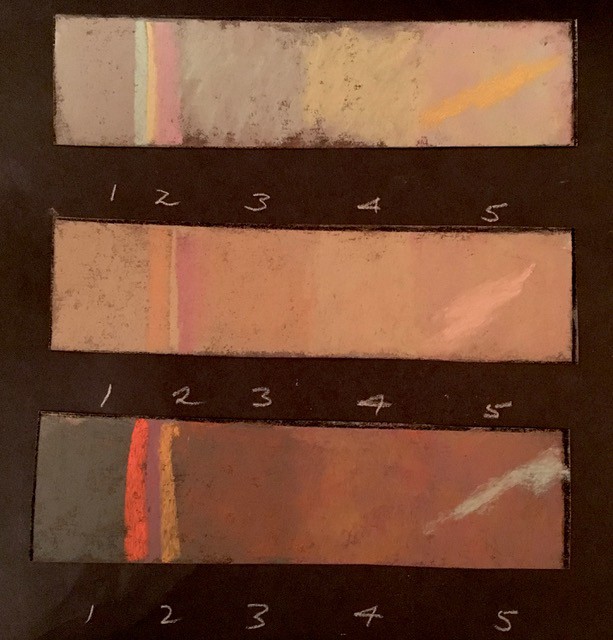
Here’s what I did:
1. is the gray I had in my pastel collection (on the computer screen they reproduce nicely, on the UART surface they all looked drab!)
2. are the bare colors I used on top of the gray in the order shown.
3. is the next layer of color
4. the next and last is the gray I achieved with all the layers complete. I then added a stroke to show the vibrancy set up by the new gray.
So the first swatch my gray at square 1 is a warm, putty colored blah kind of color. We need to liven it up and bring out the “flavor”. Remember I chose the next pastels that were very close to the same value (degree of light or darkness) as the first gray. So there are my colors above the 2: turquoise, yellow and rose. Next I put the turquoise over the gray (3), next went yellow on top of that (4) and I finished with rose (5). I have a distinctly different gray than what I started out with and it is far more interesting than square 1. I then put the orange on top of that to show how it stands out with this beautiful gray as a background.
If you like, you can stop when you have layered only one color over the gray, or stop at two. It’s really up to you and what interesting gray you’re after.
Would I have achieved a beautiful gray without starting with that first gray and just using those three colors: turquoise, yellow and rose? The answer is yes but there was a warmth and depth added when I used that first drab gray as my first layer. Try it for yourself.

Another tip is to lightly apply the layers and not fill up the surface tooth until at the final layer. UART accepts many layers so it’s easy to add and add. Also avoid applying the colors equally. Use more turquoise than magenta, or more yellow than rose. I don’t blend with my finger and I leave the colors alone so they blend optically.
Using only the pastels I chose for these samples, I then went ahead and painted, “Northern Sky”, 8 X 10 on UART. You can see the layered grays and how well they support the more saturated colors and provide that much more interest to the scene than if I just stayed with the colors as is out of the box.

“Northern Sky” 8X10 pastel on UART
Pastels are meant to be layered so go ahead and try some of these combinations. They will help you develop that all important skill of adding lively grays to your paintings.
Christine Camilleri, AFCA, MPAC, PSA Assoc.
Visit Christine’s website at www.christinecamilleri.com to view more of her work.